Showing posts with label Citrus Twist kits. Show all posts

Thursday, August 15, 2013

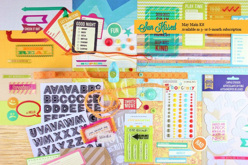
May Citrus Twist kit "Sunkissed"

The May kit:
I was really not impressed when I saw the sneaks and the reveal. It really kind of looks like a hodgepodge, although the light oranges and blues do give it a beachy, summry vibe. I was not looking forward to playing with it, and in fact it ended up being my last CT kit. I loved a lot of the previous kit, the customer service and the value, but sometimes the kits just weren't "me". Anyway,
 
 BeckyFleck/ Pagemaps sketch

 This is so not my style, but it was fun to try. And the mist on the HS Colormagic banner? "Mixed tape" from the SC NEON set. Not very neon-y, but it did make a very nice teal. The canvas butterflies were sprayed first with OA Comet Tail mist and then Heidi Swapp Mustard mist to give it them a glimmer look.

 I bought the Sea Shells silhouette cut just for this page (it was .50, so not a huge outlay). I started placing groupings of the buttons around the page but they looked off, so on a whim I put some of the frames from my much sought after The Pier frame pack (took me months to track those down since they were out of stock everywhere) around them. I like them much better.

 An easy and quick one. Dad is a KBS (Kerri Bradford Studio) freebie cut, and was one of the first things I cut out with my Cameo, before setting it aside. Glad I held on to it :)

 Lots of journaling tidbits.

 I was so at a loss for this paper, and the B side is an even bolder giant orange on orange polka dot. I think it worked well for this page, though.
And a last one. The feather paper/bird pic should have been obvious, but sadly it was the last one of the bunch.

There is still one full sheet of pattern paper and 2 full sheets of cardstock (bright melon orange and bright lime green, so they'll never get used by me) left, along with a decent amount of scraps, almost a full roll of washi and some embellies, but I'm ready to move on. Still, 7 layouts that I like out of a kit that I didn't like is pretty good, I think.

100 layout total: 44/100

Monday, August 5, 2013

Citrus Twist April 2013 kit

This kit:
was so not me (look at all the pink! the florals! the frou frou!) And yet, I really enjoyed playing with it and stretching my comfort zone. I also had the Maggie Holmes fabric frames (which were featured in one of the add-ons) so I tossed those in my pile, too. A full pack of those, a full pack of the Crate Paper photo overlays, and a full pack of the Maggie Holmes die cuts meant that there were tons of embellishments in the kit.

This layout did not start out with the two cluster of die cuts in the pink areas. I had stamped some phrases in pink, but they just looked like they were floating, so I had to come up with a way to cover them up.

 I didn't like a lot of the overlays (too yellow), so I got creative and staring using them as mats.
 This one is unusual for me, as I almost never use colored cardstock (other than black) for a background. I just really liked how the photo looked against it, and decided to build the page around it.
 As I was sitting, trying to think of how I wanted to type out the journaling, I was sort of congratulating myself on how many of the die cuts I had used. Enter light bulb moment to use the last remaining die cuts that could be used for journaling.
 
Thoughts on this kit: It surprises me how much I liked working with this kit and how much I like the layouts. So, I guess I need to maybe play with pink every now and then. :)
 
100 projects total: 28/100

Wednesday, April 24, 2013

Citrus Twist kit (March 2013)

I have to admit, I wasn't thrilled at the sneak peek, when I saw that the SC Darling Dear line. It wasn't something I liked, so I had passed it up in the store. So, when I got the full reveal and saw the kit, I wasn't looking forward to using it. In fact, this was the 6th kit of my 6 month membership, and I even considered cancelling but decided to wait it out a little while longer.
Anyway, I loved this striped Dear Lizzy 5th and Frolic paper for a background and finally got to scrap these Instagrams from last spring. A thread on Scrap n Yap had me thinking about "old" supplies and I had a case of old letters that I had cut out on my desk and challenged myself to use some with this kit. Not sure why I put the little pom pom round on there, maybe to be like an asterik. For s'mores, I originally tried to outline the mistable/inkable Thickers, but that just made them look dirty, so they got a full swipe with a brown ink pad.
 
When Brandon saw this one, he said, "Oh, man, you used the obnoxious paper!" LOL, it is a bit out there. The other side is zebra print. I used the Tim Holz tag die to cut some tags from the BoBunny Double Dot paper and the gold "pow" paper. I thought it needed something else, and I had the LYB burlap butterfly stickers on the desk, so I though, why not? A pull out journaling spot will go in the envelope, as soon as I can get Rick to cooperate.
 This one started out quick, but sat on my desk for a few days while I figured it out. I'm pleased I finally got to use the Jolees playset sticker. I finaly got the idea to add the yellow buttons to balance out the yellow paper. I needed a smaller font for the title, and since Jacob was in my room the entire time, I went with Thickers rather than let him know what the cameo does.
I did use the cameo for this title, but it doesn't really stand out. I think I need to add a tag by the pic with some journaling to finish it off.
This one sat on the desk for almost a week while my parents were here and I was deciding what to do. Still not real impressed with it, but it will do. At this point I was tired of the kit, but didn't really feel I had gotten my money's worth out of it, so I challenged myself to do one more.
And came up with this one, whch I actually do like. For the alphas, I dug through that container of "old" letters and found these Making Memoris "game pieces" thin chipboard alphas from about 2005ish. There is only one of each color, so I had to get creative for the second "a".
 
And this is what I have left:
 
Thoughts on this kit: Not my favorite. I do generally like the layouts I did, but there is a ton left, some of which just won't get used. Almost the entire sheet of the Darling Dear paper will go in the giveaway paper, and I'm not sure what I'll do with the chipboard pieces. The alphas can always be used paper. That bright orange cardstock is definitely going in the giveaway pile.
 
50 projects total: well...this should make it 21, but I went shopping for some PL cards and the $1.50 Thickers at Marshalls, and an order from 2peas, and...so I officially failed the challenge, LOL. Wasn't the first one, but didn't hold out the longest, either.

Citrus Twist "This is My Life" kit (Feb 2013)

Nice and bright, with a lot of good embellishments. I think between the bits I bought, and the embellies that have come in kits, I ended up with just about the entire Amy Tangerine Ready, Set, Go! collection (not that I minded).
First up:
I wanted to use this Pebbles flying geese quilt pattern from the Walnut Grove line, and I thought it would do a decent job counterbalancing my bright red shirt in this old pic of Brandon and me. It's a bit loud for a background paper, so I covered a good portion of it with paper strips.

And then this one that Jacob loves:
As soon as I saw the canvas elephant sticker, I knew I would be using this kit to scrap this instagram of the stuffed elephant that Jacob bought on vacation and to record the poem from a Barney video that he has us recite all the time. I like how the little pops of blue keep it from being too pale. The heart is a Heidi Swapp color magic mistable from Michaels, spritzed with HS Teal color shine. I had done it for a different layout and didn't end up using it.
My baby isn't such a baby anymore, lol. I really don't know what to do with this gold dot vellum from the Dear Lizzy 5th and Frolic collection other than tear side strips from it.
This one's kind of awkward. The 12-12-12 flair badge was from the October Afternoon Christmas box I bought myself for Christmas.
I really don't like that you can't really read the title, so I may have to go back and outline it or something. The ledger paper is the "B" side of the red label paper.
I thought I was done, but started playing with scraps and came up with this one. I kind of like how it turned out.
 
And what I had left:
Thoughts on the kit: It seem like Citrus Twist always has one really bright cardstock that I don't get around to using (in this case, the bright aqua). The Pebbles journal card pad has also gotten used on some PL spread and the alphas are a nice, basic font that will get used again. Overall, I liked it.
 
50 projects total: 16
 

Monday, February 18, 2013

Citrus Twist: Home is Where the Heart Is, LOAD 2/17-2/24

The sneak peeks of the January Citrus Twist kit made me nervous, since it seemed all I could really see was the Crate Paper chipboard accent sheet, the floral paper and the pink ribbon. Ummm..really not my thing. But...all together, I really kind of liked the kit and I ended up with 8 layouts, the most of any of my kits so far. And I'm still ahead on LOAD, because no one needed me this weekend. Really. Rick took over the bedroom/TV and worked, Brandon took over the living room/TV and played on the xbox between chores, and Jacob was content with his computer and an occasional bubble bath, leaving me to play. It felt weird.
 
The kit:
 
 
(February 17). When I first took everything out of the box, my eyes settled on the Dear Lizzy house paper and the Echo Park title strip. As I was playing around with it, I got the idea to cut out some of the houses and see what I could do with them. Then I thought maybe I could ground them with the pink ribbon. Then came the green swatch, and then the gray to tone it down a little. It was looking a little disconnected and very pink/green, so I used the inker on a new Ali Edwards house stamp and tucked them behind. I kind of like how they look. I don't do a lot of fussy cutting, or cut-out stamping, or even a lot of misting, so this was something new for me.
(February 18). This doesn't even look like something I made, right? LOL. I loved the floral pattern because it was just so pretty, but I never would have bought it because more than likely it would sit in my stash for a couple years before I sighed and gave it away. Being in the kit forced me to use it. This was a self-portrait I took with my ipod on my birthday, so that made the "theme" of the layout easy. The rose ribbon didn't come in the kit, but since it was sitting on my desk and matched, I figured, why not? If I'm gonna go girly, I might as well go really girly. :) I had taken out several of my embossing folders samples and was going to use the swiss dot one on some of the pink cardstock, but liked the white better and just used...my sample. Ooops. Sprayed it with some green glimmer mist, which I ended up really liking.
(February 19) Complete change of course! The green is seen in the first layout, but the stripe is the backside of the floral pattern and the red hearts is the backside of the teal days of the week page. I was waiting to figure out what I wanted to do with this photo, so once I opened my Silhouette program to look at my phrase/title options, everything fell into place. The "adorable" tab is left over from the CT November kit. I have a ton left and will be using them up forever, I think.
(February 20) This little quote card is also from the November kit and fell out of my baggie when I was getting the tab for the last layout. It reminded me that I had some Instagrams I had taken early on and hadn't even printed out yet, so I grabbed the blue chevron paper to add to the "blue" theme. Then I saw the "3" on the chipboard sheet and wanted to use it but had to find out ways to balance out the pink, so that's where the banner, washi and strip of pink patterned paper from my scrap pile comes in. The arrow was part of the stamp set and stamped with the chalk inker. I'm really loving those inkers.
(February 21) Another girly layout, can you believe it? The pale stripe paper is the backside of the Dear Lizzy house paper and I knew I wanted to somehow use it. I also knew I wanted to use some more of the floral chipboard pieces, so it just kind of evolved from there. I even used some MM ribbon from my stash :)  I tried to take an ipod self portrait each month last year, and it feels a little good to get a few pics of me in the scrapbooks.
(February 22) Not sure I like the monochromatic look. I was going for a no matter the time (days of week paper) or the place (strip of city map paper), we're still in love. The manila card is actually a February flash card; not sure why I don't really use them as they are. I had already completed my January PL pages by the time I got to this kit, so it seemed like a good base for my title, if nothing else. "Crazy" is from a Pink Paislee stamp set (weird story: I ordered it from 2peas last year, but didn't open it until a couple months later. When I did, I realized that the "newsflash" stamp was missing and had been replaced with a heart stamp and then the package was resealed. I guess somebody really wanted that stamp). And yep, I know my N is upside down. I wondered why it was upside down in my box, and after I stamped it I remembered that that stamp was manufactured upside down and I was trying to remind myself of that. Obviously that worked well!
(February 23) Still needs a photo! I want either a photo of the 4 of us or to make a Diptic collage of pics of us. Can't decide. Again, I wasn't thinking and used an embossing folder sample on the layout. Also used was one of the stamps from the Studio Calico January PL kit.
(February 24) I thought I was done, but this leaf pattern (the back of the green dot paper) made me think of birds. Which had me looking at the bird chipboard piece, so I printed out a pic from last spring (Rick yelled for me to grab my camera and pointed out a baby bird on our fence behind the garage).
 
Thoughts on this kit: I didn't expect to, but I really loved this kit and enjoyed working with it. This was really the first time that I played with misters, even though I have several from October Afternoon. And (insert embarrassed smiley face here), I actually liked it enough (especially the glimmer mist with glitter in it) that I used my Michaels 25% off everything coupon to buy 6 bottles of the Heidi Swapp Color Shine that they carry at Michaels now.

Wednesday, February 13, 2013

December Citrus Twist Kit, LOAD 2/10-2/16

That's right, I'm ahead of the game! :)  I want to keep layouts that I do with a kit together, so since I'm going through kits right now, there will probably be a couple days delay in posting new layouts while I'm playing with the January kit.
 
The December Citrus Twist kit:

For December, I had either lots of photos (decorating the tree, opening presents, etc.) or single photos. It didn't seem like there was much in between. I also started using Instagram again, so a lot of the single photos were squares. I decided to use the kit for my single photo layouts, so I could "play" more, since I like the single smaller photo/lots of layering/clustering look but not sure how to go about it.
First up (February 10), the Best Quality tag was unintentional until I got to making the title, then it was kind of awesome, LOL.
Next (February 11) was my single lonely Memories in the Park photo. This one wasn't Instagrammed, just made into a square using Photosheet, since it wasn't that great of a photo. I was having trouble with putting something up in the right hand corner to balance the layout, and ended up grabbing the All is Bright (the name of that paper line) from the cut off strip and using a small tag to cover the designer's name. I think it worked well, but then I needed something blue on the right side to make a triangle between the blue felt flower and the blue in the background of the All is Bright. Enter the never ending roll of tickets :)
This one (February 12) didn't quite end up how I planned. "Celebrate Your Inner Elf" was a round shaped Silhouette cut, but I wasn't sure how to really separate and cut out the circle part and wasn't in the mood to play around with it, so I just moved the text around and then cut it out. My Silhouette did something weird, so it took awhile and I think I need a new blade already, because the "your inner" was very chewed up. As it happened, when I put the photo into Photosheet to print, it was put in sideways (I seem to have that effect of electronics), but I wasn't worried because it's a square and I could trim it. Anyway, I realized that since it was facing sideways, I could cut it into a Polaroid shape, which gave me a little mat for part of my title. After that, I just put "elf" on a tag to help it stand out, trashed the chewed up/ripped words, and stamped the rest of the title. I knew I was going to have long journaling, because I wanted to tell the story of why I do Elf even the the boys are older. I have no patience for learning how to do wrap around text boxes and figuring out spacing for them, so I tucked my paper in where I wanted it, created a light tracing with a pencil to give me borders, then typed it up on the typewriter. Easy peasy, took about 5 minutes. There really was no green in the kit (other than the washi tape), so I used some Coredinations cardstock, because I just really felt this layout needed some green. I used a section left over from cutting the title to use a My Favorite Things label tab die and stamping it with a stamp from the kit.
(February 13) I kind of wondered what I would do with this North Pole paper, and thought about using it with the pic of Jacob's last trip to Santa, but I had a large title I wanted to use with it, and a fair amount of journaling, so it would have covered most of the paper. As I was shuffling things around, I picked up this photo of Rick and me, which I had a different plan for, set it down on the paper, and "no one else in the world for me" popped into my head, and after that it was easy. Not sure I like the confetti stars in the corners of the mat, but they're on with glue dots, so they're likely to stay. I just noticed that at the bottom of the photo mat, the sideways 8s on the tag look kind of like an infinity symbol, so that totally works for me.

February 14 - I knew I wanted to use this photo with this kit, and on the first pass through, I knew I wanted to use this collaged paper for it. That was pretty much all I knew. The woodgrain and blue looked pale, and it didn't really stand out from the background, so I added the red strip, but then it seemed bottom heavy, so the only other red I really liked with it was...the packaging from the Pink Paislee City Sidewalks tags. I was able to scoot it down far enough to hide most of the packaging text.  As a bonus, it's long enough to create more of a base for the other patterned paper. It still seemed blah, so I bordered it with strips of the blue cardstock, which I liked, so I threw in the blue felt flower to keep the blue from looking so random.
February 15 - Since it was a phone pic, my starbucks pic didn't get printed with last year's Christmas photos and I had forgotten about it. I still had it, and still wanted to scrapbook it, so it seemed fitting to use the red snowflake paper for a coffee layout. I didn't figure I would use the larger, ornate rectangle tags from the Pink Paislee set, so I flipped them over and used them as a base for my stack of stuff. I had no plans for the December calendar card, and I had already completed my PL pages, so I tucked it under the photo for interest and ended up using it for my title. I used a scrap of green to balance out the green in the photo and used one of the stamps for my subtitle: NEWSFLASH: I still don't like coffee.

February 16 - I had the idea for this layout ever since I saw this phrase cut in the Silhouette store. Since Christmas is the only time I like to shop (well, other than for scrapbooking supplies), I wanted to document that, and since I had this random pic of me (I try and take a self portrait each month for PL), I figured why not? The vintage image is from the October Afternoon Make it Merry kit I bought myself for Christmas. Again, journaling was very easy, thanks to my typewriter.

Thoughts on this kit: Loved it, although I have no idea why there was bright green washi tape, since it was pretty much the only green (other than some trees on one piece of paper) in the kit. It almost seemed like an afterthought.
Citrus Twist, November 2012/Layout of the Day/PL2013 week 5

Well, that was a mouthful! I hadn't really scrapbooked regular pages since the crop in November, and really the only other stuff I had done at the Ditch the Kids crop were my December PL pages, so I decided to jump right in with my Citrus Twist kits while completing a Layout a Day (LOAD) challenge. I didn't sign up for the actual challenge, since I didn't feel I needed a topic prompt to get me going.
 
This was my November Citrus Twist kit:
 
My first layout (Februrary 1): the little "if dreams were wishes" card made me think of how we always joke that we'd buy a house with a Teton view if we won the lottery. I found some great pics on Google and printed them as 5x7 and built my layout around that. I knew I wanted to use some of the blue paper, and the various shades of the cardstock played of the pics well. (That sunset pic is now my computer background.)
My second (February 2) layout used the green ledger paper as a background for our one Thanksgiving picture. The journaling card is actually the product backing from the Amy Tangerine 3D elements.
My third layout (February 3) was a relatively easy one. On 12-12-12 we wrote down our favorite 12 moments from 2012. I thought maybe I would use the December kit for that, but the library card paper seemed like a fun/easy way to journal it. Took a couple minutes on the typewriter. The title was my first non-practice/playing cut with my new Silhouette machine. The font is Lobster 1.4, downloaded for free from the internet.
My fourth layout (February 4) was very picture heavy. I knew I wanted to use the airplane cutout on a travel page, and we had recently been talking about the places we still wanted to visit, so the Wish List page was born. Again, pics are downloaded from Google. (For the record, on the left page they are Caribbean cruise, Mexico, Outer Banks NC, Germany, Niagara Falls, Chicaco. On the right side: Oregon Coast, Hawaii, Savannah GA, London, Williamsburg VA and Boston.) There are more, but those were the first 12 that came to mind.
Fifth layout (February 5) was inspired by several of the pieces of paper being from the Crate Paper "Acorn Avenue" line. We were inundated/attacked by acorns all fall. There were days when I walked Jacob to the bus when I wished I had an umbrella. The pic just shows acorns from the roof right about the door. The really was no thought process on here, just moving and layering pieces of papers of paper until I liked it. I even cut out one of the "Acorn Avenue" images from the cut off strip to use on the journal block.

And Project Life 2013 week 5:


I still had a decent amount of paper and stuff left, so I used it for my PL2013 week 5 spread (February 6), since it seemed to match the colors. There are also some Clementine, Turquoise and SC PL cards mixed in.
 
Thoughts on this kit: Overall, I liked it. Acorn Avenue wasn't on my to get list, and except for the blue geometric print, Studio Calico Yearbook wasn't, either. It was a fun kit to play with. I wasn't real fond of the washi this time, but managed to use it a few times, and the Prima inker (Fall Leaf) didn't get much use, but it will on other projects. I still have a decent amount of paper and embellies left over.