I have to admit, I wasn't thrilled at the sneak peek, when I saw that the SC Darling Dear line. It wasn't something I liked, so I had passed it up in the store. So, when I got the full reveal and saw the kit, I wasn't looking forward to using it. In fact, this was the 6th kit of my 6 month membership, and I even considered cancelling but decided to wait it out a little while longer.


This one started out quick, but sat on my desk for a few days while I figured it out. I'm pleased I finally got to use the Jolees playset sticker. I finaly got the idea to add the yellow buttons to balance out the yellow paper. I needed a smaller font for the title, and since Jacob was in my room the entire time, I went with Thickers rather than let him know what the cameo does.

I did use the cameo for this title, but it doesn't really stand out. I think I need to add a tag by the pic with some journaling to finish it off.

This one sat on the desk for almost a week while my parents were here and I was deciding what to do. Still not real impressed with it, but it will do. At this point I was tired of the kit, but didn't really feel I had gotten my money's worth out of it, so I challenged myself to do one more.

And came up with this one, whch I actually do like. For the alphas, I dug through that container of "old" letters and found these Making Memoris "game pieces" thin chipboard alphas from about 2005ish. There is only one of each color, so I had to get creative for the second "a".
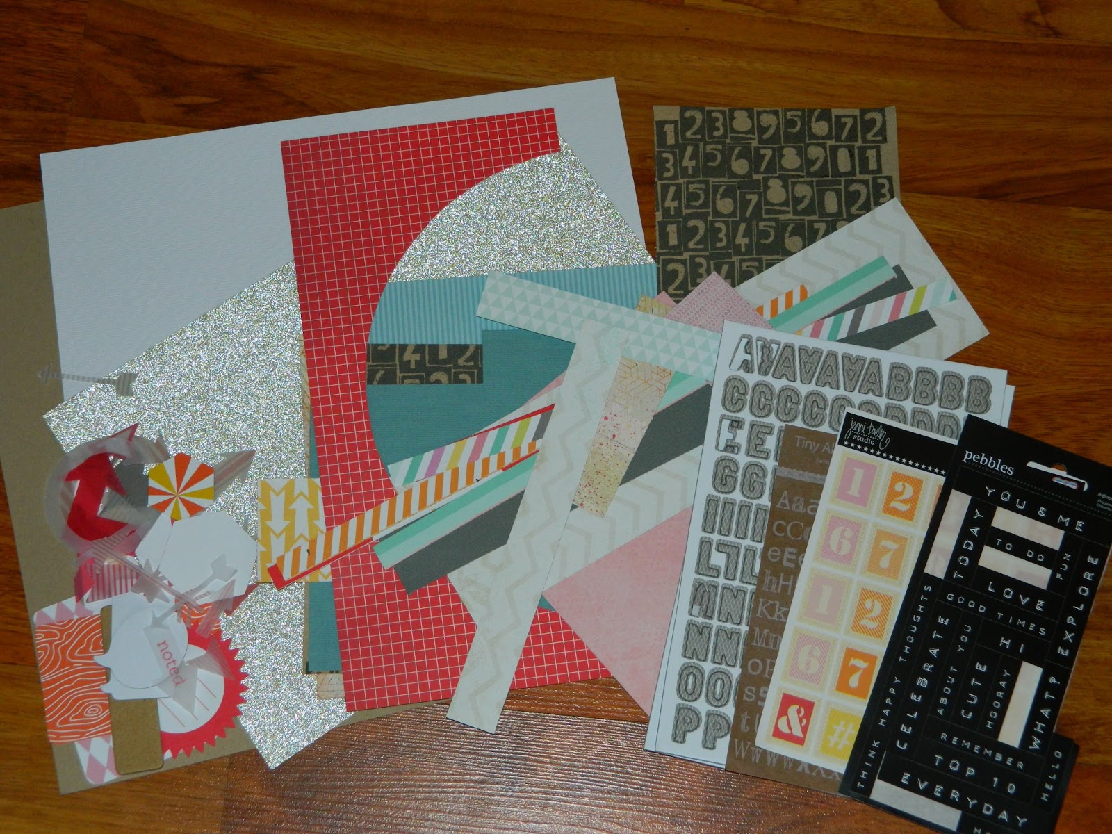
And this is what I have left:

Thoughts on this kit: Not my favorite. I do generally like the layouts I did, but there is a ton left, some of which just won't get used. Almost the entire sheet of the Darling Dear paper will go in the giveaway paper, and I'm not sure what I'll do with the chipboard pieces. The alphas can always be used paper. That bright orange cardstock is definitely going in the giveaway pile.
50 projects total: well...this should make it 21, but I went shopping for some PL cards and the $1.50 Thickers at Marshalls, and an order from 2peas, and...so I officially failed the challenge, LOL. Wasn't the first one, but didn't hold out the longest, either.