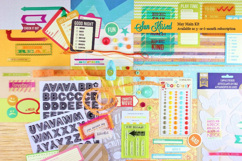
Friday, August 30, 2013

SC June kit "Roundabout"

I wasn't real impressed with the kit when I saw it, but when I got it in and moved the papers around and switched to some B sides, I liked it much better.

I added in the CP clear letters and a few pieces of paper that appeared in the add-ons.
2 layouts for the Tennessee vacation album:
 
 
and one for the California/San Francisco album:


This one will have some journaling in the arrow blocks, just as soon as I can make Brandon do it :)
 
50 projects total: 53/50
100 projects total: 53/100

Thursday, August 15, 2013

May Citrus Twist kit "Sunkissed"

The May kit:
I was really not impressed when I saw the sneaks and the reveal. It really kind of looks like a hodgepodge, although the light oranges and blues do give it a beachy, summry vibe. I was not looking forward to playing with it, and in fact it ended up being my last CT kit. I loved a lot of the previous kit, the customer service and the value, but sometimes the kits just weren't "me". Anyway,
 
 BeckyFleck/ Pagemaps sketch

 This is so not my style, but it was fun to try. And the mist on the HS Colormagic banner? "Mixed tape" from the SC NEON set. Not very neon-y, but it did make a very nice teal. The canvas butterflies were sprayed first with OA Comet Tail mist and then Heidi Swapp Mustard mist to give it them a glimmer look.

 I bought the Sea Shells silhouette cut just for this page (it was .50, so not a huge outlay). I started placing groupings of the buttons around the page but they looked off, so on a whim I put some of the frames from my much sought after The Pier frame pack (took me months to track those down since they were out of stock everywhere) around them. I like them much better.

 An easy and quick one. Dad is a KBS (Kerri Bradford Studio) freebie cut, and was one of the first things I cut out with my Cameo, before setting it aside. Glad I held on to it :)

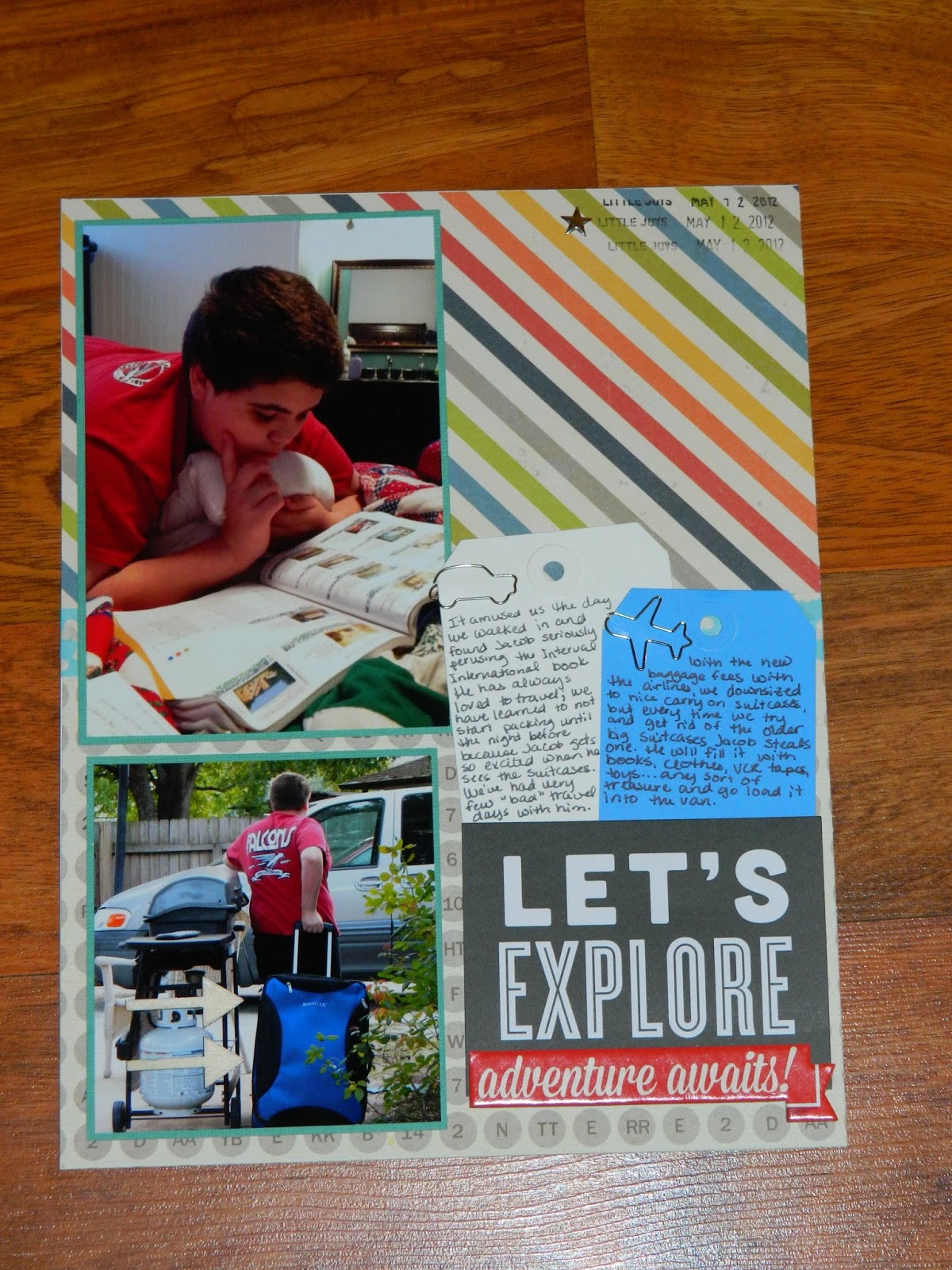
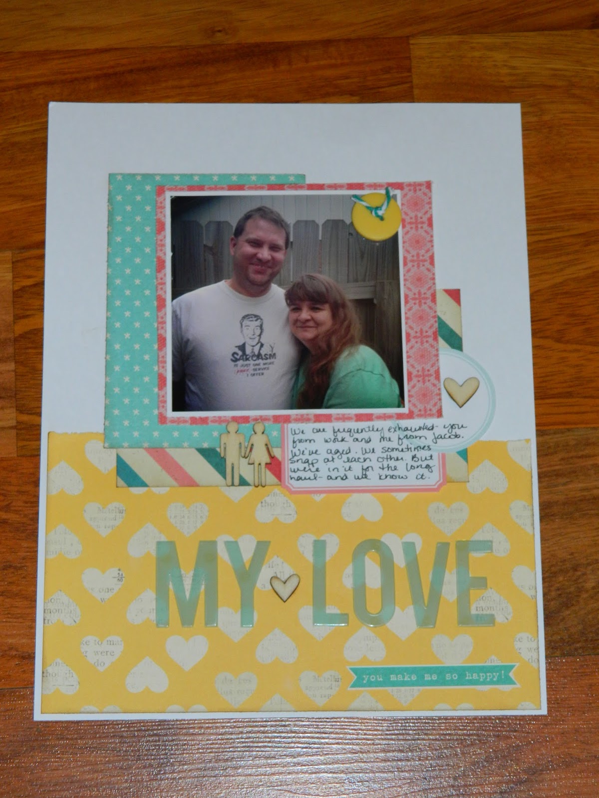
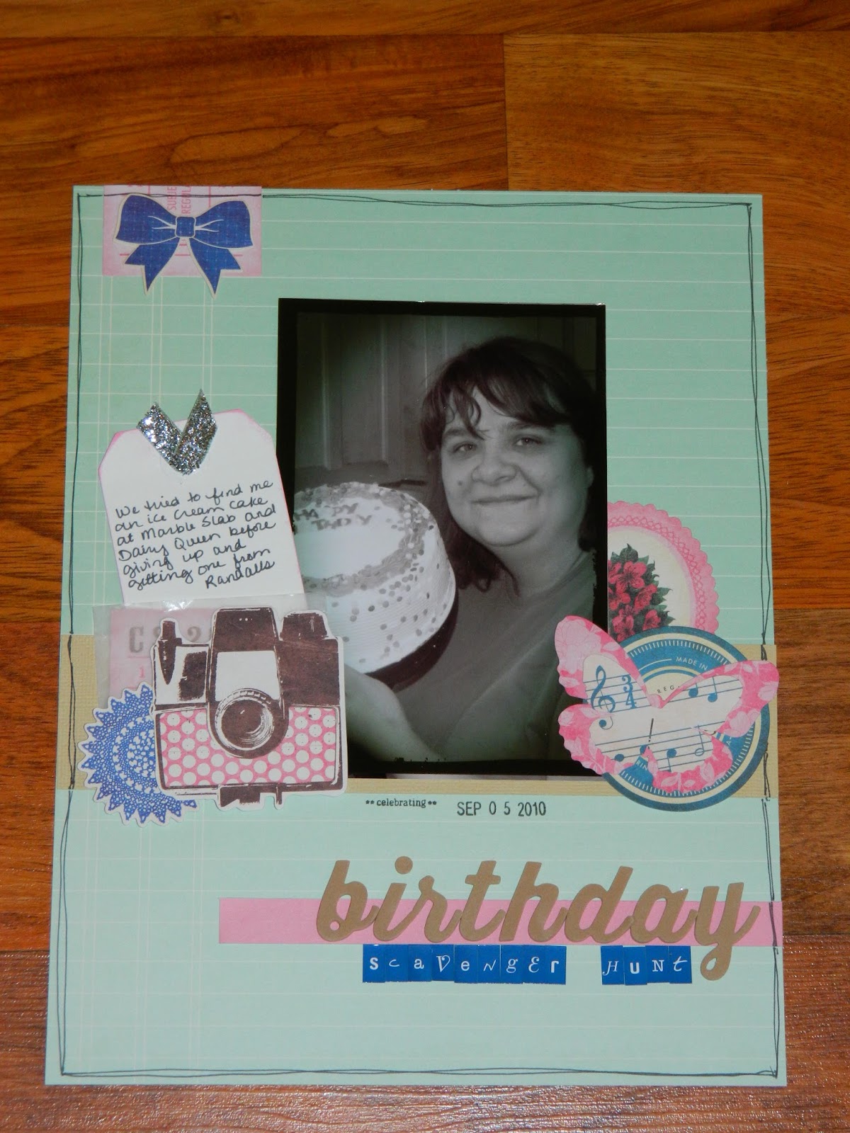
 Lots of journaling tidbits.

 I was so at a loss for this paper, and the B side is an even bolder giant orange on orange polka dot. I think it worked well for this page, though.
And a last one. The feather paper/bird pic should have been obvious, but sadly it was the last one of the bunch.

There is still one full sheet of pattern paper and 2 full sheets of cardstock (bright melon orange and bright lime green, so they'll never get used by me) left, along with a decent amount of scraps, almost a full roll of washi and some embellies, but I'm ready to move on. Still, 7 layouts that I like out of a kit that I didn't like is pretty good, I think.

100 layout total: 44/100

Studio Calico "Planetarium" (May 2013)

First impression of the kit: good. Several patterns I would have bought. Not excited for the resin stars or the clear sticker strips. Always love when we get labels.
Items (from my stash) that appeared in the add-on kits: green acrylic letters.
 
Since I figure that the resin starts would be the hardest items for me to use, I tried to make sure I used those early.

 I don't know, it seems kind of lacking but I don't know what else I want to put on there.


 Meh. I did use up another of the MH fabric frames, though.


 Added in a sheet from the DL 6x6 pad to tone down the pink and a few embellies from the same line.


I like the layouts, for the most part. Impressed with how many full/partial titles I got out of the wood veneer letters, and I still have half the container left.

100 projects total: 37/100

Monday, August 5, 2013

Citrus Twist April 2013 kit

This kit:
was so not me (look at all the pink! the florals! the frou frou!) And yet, I really enjoyed playing with it and stretching my comfort zone. I also had the Maggie Holmes fabric frames (which were featured in one of the add-ons) so I tossed those in my pile, too. A full pack of those, a full pack of the Crate Paper photo overlays, and a full pack of the Maggie Holmes die cuts meant that there were tons of embellishments in the kit.

This layout did not start out with the two cluster of die cuts in the pink areas. I had stamped some phrases in pink, but they just looked like they were floating, so I had to come up with a way to cover them up.

 I didn't like a lot of the overlays (too yellow), so I got creative and staring using them as mats.
 This one is unusual for me, as I almost never use colored cardstock (other than black) for a background. I just really liked how the photo looked against it, and decided to build the page around it.
 As I was sitting, trying to think of how I wanted to type out the journaling, I was sort of congratulating myself on how many of the die cuts I had used. Enter light bulb moment to use the last remaining die cuts that could be used for journaling.
 
Thoughts on this kit: It surprises me how much I liked working with this kit and how much I like the layouts. So, I guess I need to maybe play with pink every now and then. :)
 
100 projects total: 28/100

Friday, August 2, 2013

Minions


My laughable attempt at Twinkie based Minion cupcakes to eat while watching Despicable Me.
 

Jacob's birthday cake

I hadn't really planned to make a cake, since 1)Jacob's not much of a cake eater, and 2) we got Cinnabon for breakfast. But, when Jacob takes a cake mix out of the pantry on his birthday and says, "cake!" you really can't say no. So, this is what I came up with with what was in my baking cabinet. Jacob selected the flags.

cards (Terri)


Girl Scout cards (Terri)